
ZEIT Time Travel
A responsive travel booking site thoughtfully designed to make the unknown, easy and effortless for all travelers.

Project Type: B2C Travel & Tourism
Role: Research, UX/UI Design,
Duration: 80 hours
Project Overview
Zeit requires a streamlined and easy to use platform where they can easily sell tickets and educate travelers on their service. They will also require an engaging and trustworthy brand identity to help generate and hold public interest.
The Challenge
ZEIT is a new business, attempting to offer a unique service that has never been attempted. The biggest challenge the company faces, is gaining the trust of travelers engaging with an expensive and potentially hazardous service. In what ways could ZEIT’s website create a worry free experience that builds trust with new travelers, while also offering a seamless ticketing process from start to finish?
The Solution
Design a responsive website with a clean interface, allowing easy access to information, and a streamlined ordering process that enables users to easily find and book their desired trip.


RESEARCH
Research Plan
ZEIT was was in need of a responsive platform to sell their tickets and educate travelers about their new service. They also requested assistance with a logo design and brand development. In order to design a website and brand that would meet their business needs and encourage user engagement, I needed to understand:
Key words and categories that users would expect when searching for a trip
How users prioritize different types of trips, such as packages and single destinations
Pain points associated with the existing booking process on related travel sites
Challenges
Due to the nature of this being a completely new service with a lot of unknowns, there were minimal resources available to help guide my research questions and assumptions. I would rely mostly on existing travel sites, to guide my research and inform my design decisions.
Competitive Analysis
I researched the design patterns of existing travel sites to better understand how they organize information, and to better understand trends that exist within the industry. I learned that:
Most sites offered a variety of different ways to search across their platform
There was often an overwhelming amount of filtering options
Most sites relied on a very clean interface with large, enticing photographs
The booking process felt clunky and overcomplicated on some larger sites


User Research
I conducted 1:1 interviews with users of existing travel sites to better understand their booking experiences, and learn more about their expectations. I was mainly trying to find out:
Why might users choose one booking service over another?
What types of filtering options would users expect to have available to them?
What preliminary research questions do users typically ask before booking a trip?
In what ways were their previous experiences with travel sites positive or negative?
Research Findings
Visual Aids
Most users preferred to utilize websites that used a lot of visuals to explain their services and display accommodations. The addition of mapping features and a large variety of photos, were likely to help with user engagement.
User Feedback
There was a lot of concern for safety with the type of service ZEIT was offering and most users would be able to suppress those concerns through easily accessible user reviews and testimonials.
Simplicity First
There was a strong desire among all users, to simplify the entire process of finding and booking travel. Users were frustrated with the overwhelming amount of filtering options, categories, and additional add-ons requested throughout the booking process.
DEFINE
Meet Kate
Based on my research, I created one user persona that I felt most closely embodied the types of users most likely to engage with ZEIT and their service. Multiple personas didn’t feel necessary, due to a fairly isolated list of user needs and frustrations.

Reframing The Problem
Utilizing my persona, I would then revisit the business goals for ZEIT and try to come up with ways to align those goals with the goals and needs of the user.
How can we simplify the checkout process?
How can we display all of the necessary information in a way that is clean and accessible?
A Simple Structure
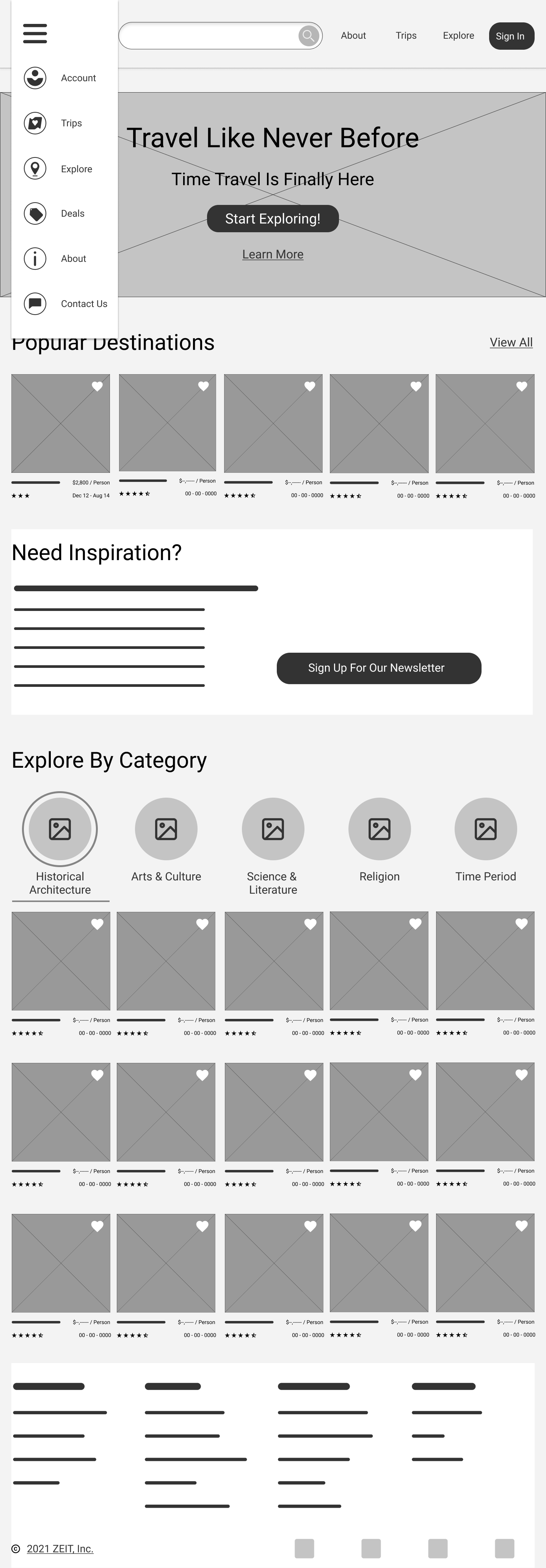
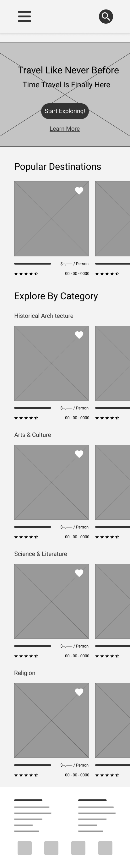
I set out to build a website structure that would incorporate only a handful of key features necessary for ZEIT and its users. My main goal was to keep the overall process as simple as possible.
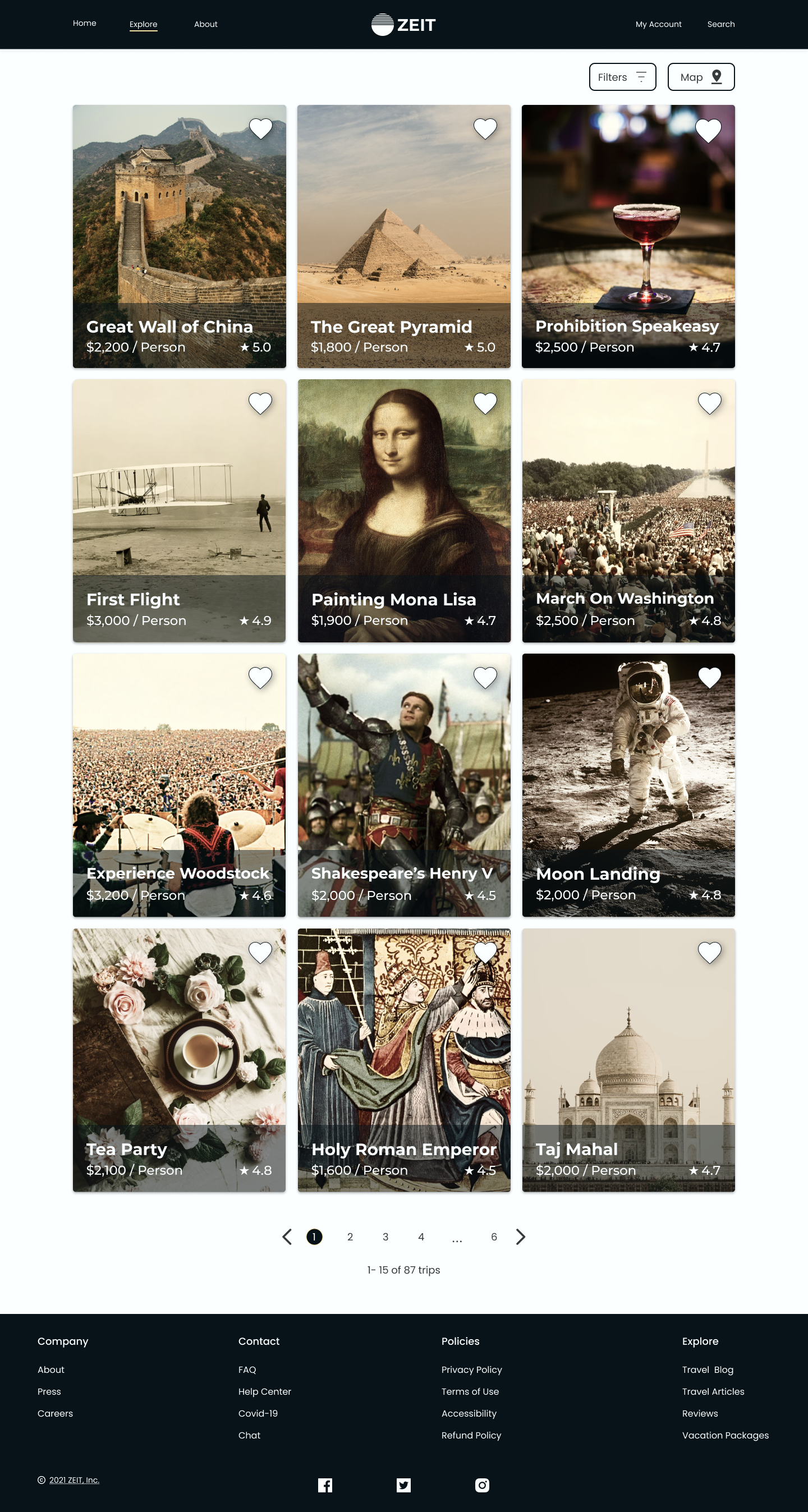
Users would have a few different ways that they could search the website, and the trips would be split up into 5 key categories to make it easier to narrow down their search.
USER INTERACTIONS
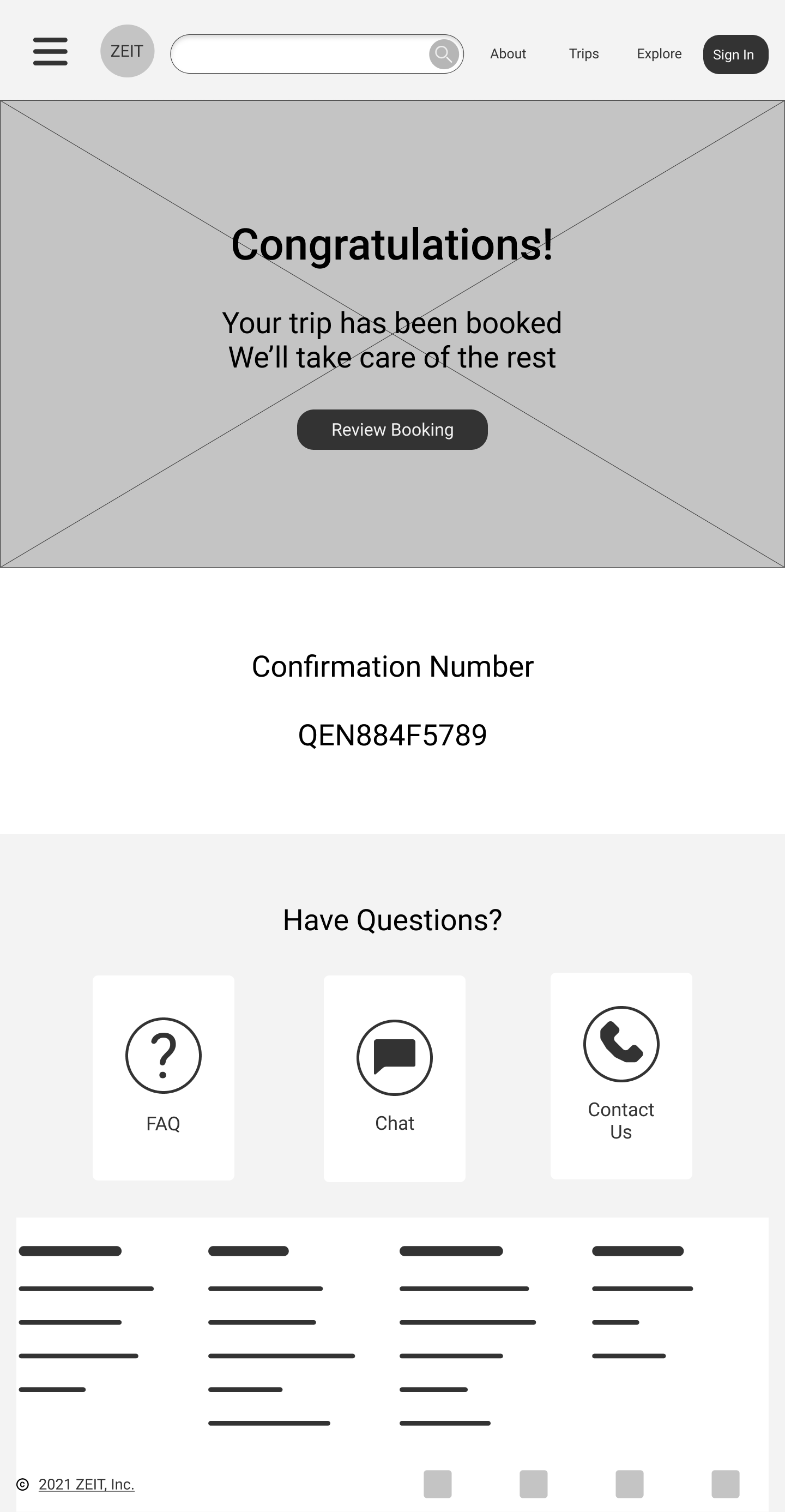
The main purpose of this website would be to get users from the home page to the trip confirmation page as quickly and seamlessly as possible.
To ensure this process would be easy and intuitive, I mapped out a simple user flow for a traveler searching for, and then proceeding to book a trip they were interested in.

IDEATE
Exploration
After exploring design patterns of existing travel sites, and taking into consideration business and user goals; I began creating desktop wireframes in Figma.


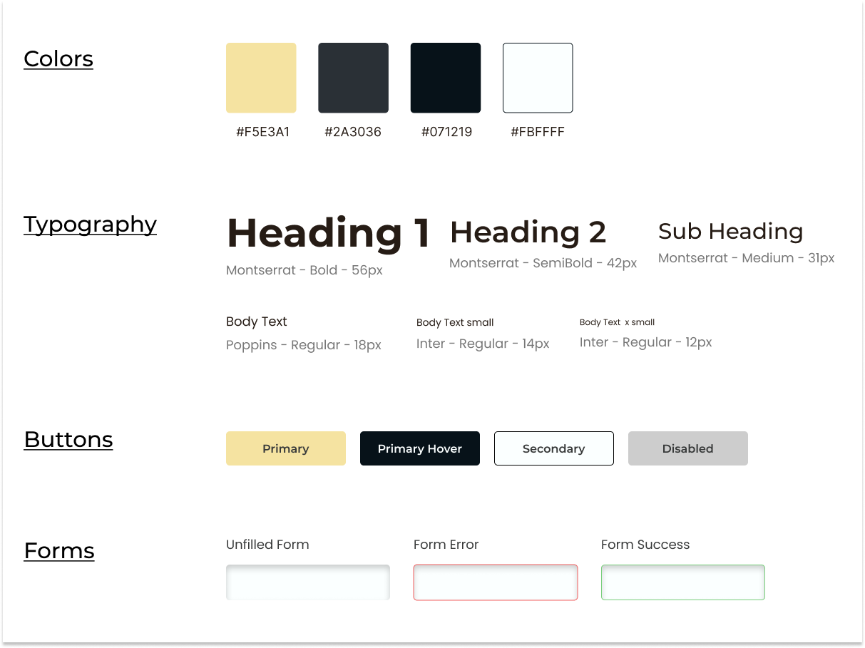
Creating The Brand
The brand image needed to be sophisticated and trustworthy, and I wanted to establish a simple logo that would stand out and portray the idea of time travel.
I chose a color palette that is bold and classy, to cater more to the market that would have the most interest in using this type of service.

PROTOTYPE


TESTING
User Testing Overview
I conducted one round of user testing with 8 participants, with the main goal of discovering the following key factors:
Is the website design intuitive and easy to use?
What approach do users prefer when trying to find and book their trip (explore, search, etc)?
Are users able to find all of the information necessary to confidently book a trip?
What barriers may exist, that could prevent users from completing their task and following the expected user flow?
Testing Feedback
“There are multiple ways to easily search for things.”
“Sometimes it’s hard to discern what can and cannot be clicked.”
“The overall layout is great and the order of information makes sense.”
“The header at the top of the page feels a little large, but I love the other elements.”
“I wasn’t able to ‘save’ a trip for a certain date, I was only able to ‘like’ it.”
“I’d like to see more of the experiences just by scrolling down rather than clicking ‘see more'“.
“Trips vs Explore tab was a little confusing.”
“Maybe add testimonials from customers who have already used the service.
Key Takeaways
Navigation And Layout
Overall users seemed to find the general site structure and layout to be intuitive and easy to navigate.
CTAs and Consistency
There was some confusion around some of the CTAs and what would happen if they were clicked. There were also some inconsistencies with naming of certain items on the site.
Reviews And Testimonials
Multiple users pointed out that they either couldn’t locate testimonials and reviews, or that they weren’t as accessible as they should be.
Next Steps
Continue to build out new pages for the website and continue to add new features.
Conduct additional user testing as more features and pages are being created.
Continue to revise prototype based on high priority importance.
Summary
This was a great opportunity to learn my own design process and gain confidence in my abilities as a designer. This was a fictional business with a challenge that was rather difficult, given there is no existing business to compare it to. I was able to practice the different stages of the design process and gain a better understanding of how to conduct user research and different ways to synthesize that information.
As a next step, I plan to conduct additional interviews to gain a larger pool of information and develop a better understanding of the problem at hand. This will help me to iterate on my current design and create additional pages that do a better job of catering to a more defined understanding of the needs of the user and the business.
In my next round of interviews, I plan to develop less generalized questions. I initially asked questions that were much too broad, leaving me with an understanding of the problem that was far too generalized. This was a great learning experience and I now have a better understanding of various ways that I can conduct better research to improve my understanding of the problems I need to solve.