
Rethinking Medical Software
End to end design of a nursing specific application, designed for optimization, increased efficiency, and error reduction.

Project Type: B2B Medical
Role: Research, UX/UI Design
Duration: 80 Hours
Project Overview
This project and application is focused solely on nurses and simplifying the EHR interface and charting processes that currently exist on the most common medical software. This application will help simplify the way patient data is displayed, increase overall efficiency of accessing and documenting information, and help minimize overall error rate.
The Challenge
Nursing processes are not conducive to the fast paced and chaotic environment that they are exposed to on a daily basis. Nurses are also documenting crucial patient information using overcomplicated software, often installed on outdated equipment. In what ways could patient data and processes be simplified, to reduce error and foster an environment that allows better care for patients?
The Solution
A streamlined application designed to be used on a tablet. The smaller screen would naturally allow for a streamlined approach to outdated processes, a clean dashboard clearly displaying patient data and tasks, and a portable solution that can take patient documenting everywhere nurses go.

RESEARCH
Research Plan
I utilized market research and nurse interviews to gain a better understanding of the environment that nurses currently work in, daily tasks being completed, and patient documenting in the most common EHR (electronic health record) applications.
I wanted to specifically understand:
Where nurses are spending the majority of their time, in regards to software and documentation.
What expectations users would have with a portable solution to daily activities in a nursing setting.
Specific goals and pain points within existing software and general processes.
Market Research
I began by gaining a better understanding of the interfaces and functionality of a few of the most widely used EHR applications. I learned that:
All of these software solutions have overly complex interfaces containing an overabundance of icons and menus.
Many actions take far too many clicks and aren’t forgiving to user errors.
Crucial patient information like emergency contact information, allergies, medications, etc are often hiding behind multiple screens and can be very difficult to find quickly.


User Research
I connected with nurses working in varying environments and had in-depth conversations, to gain a better understanding of day to day functions, task lists, processes and protocols they follow, software they use, and challenges they face.
Research Findings
Poor Design
Excessive drop downs, icons that are hard to decipher, confusing color coding, and an overabundance of clickable items, create many unnecessary barriers to successful documentation.
Time Away From Patients
Nurses spend a vast majority of their time taking notes, and documenting medication and assessment data on slow, overcomplicated software. This takes away from the time they could be properly caring for patients.
Portable Is Better
A surprising amount of medical facilities still require medical staff to sit at a desk to process patient information. Having access to a tablet or other device that is portable, would help drastically reduce time away from patients.
DEFINE
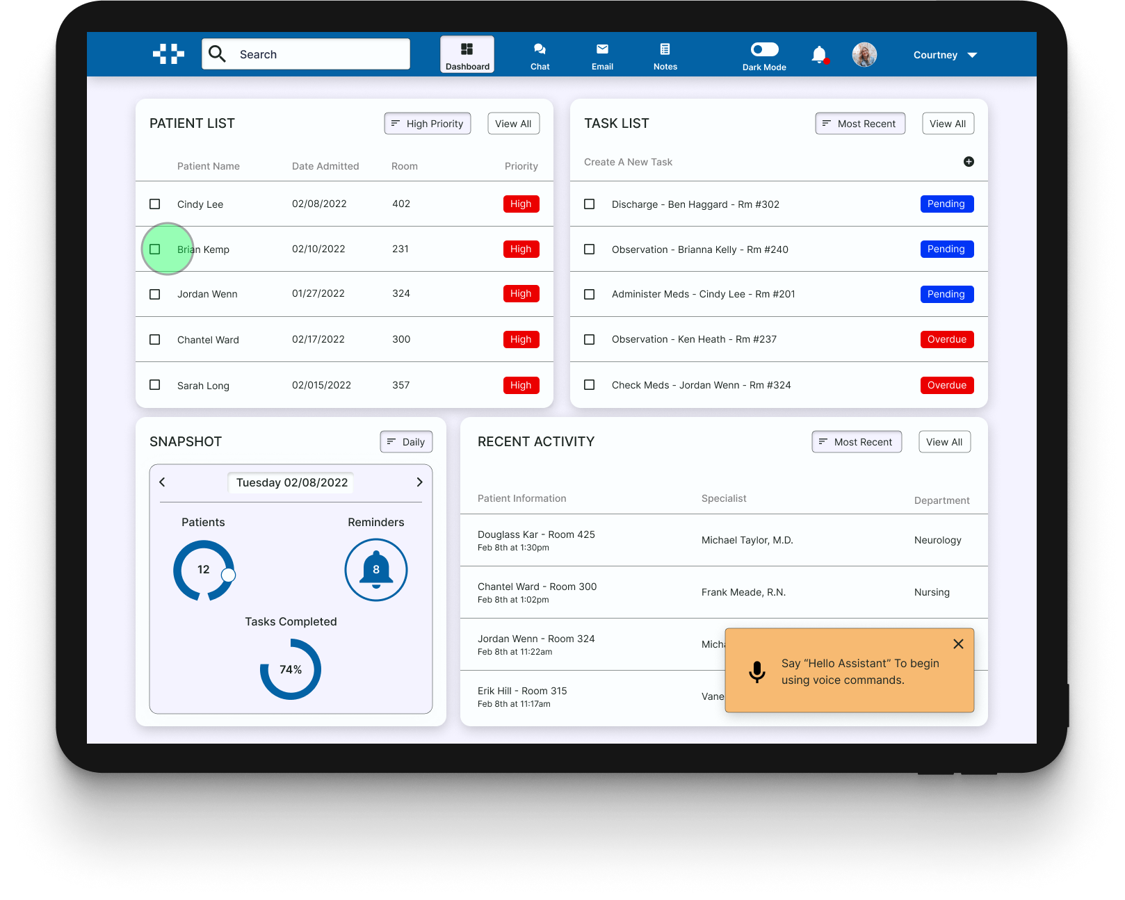
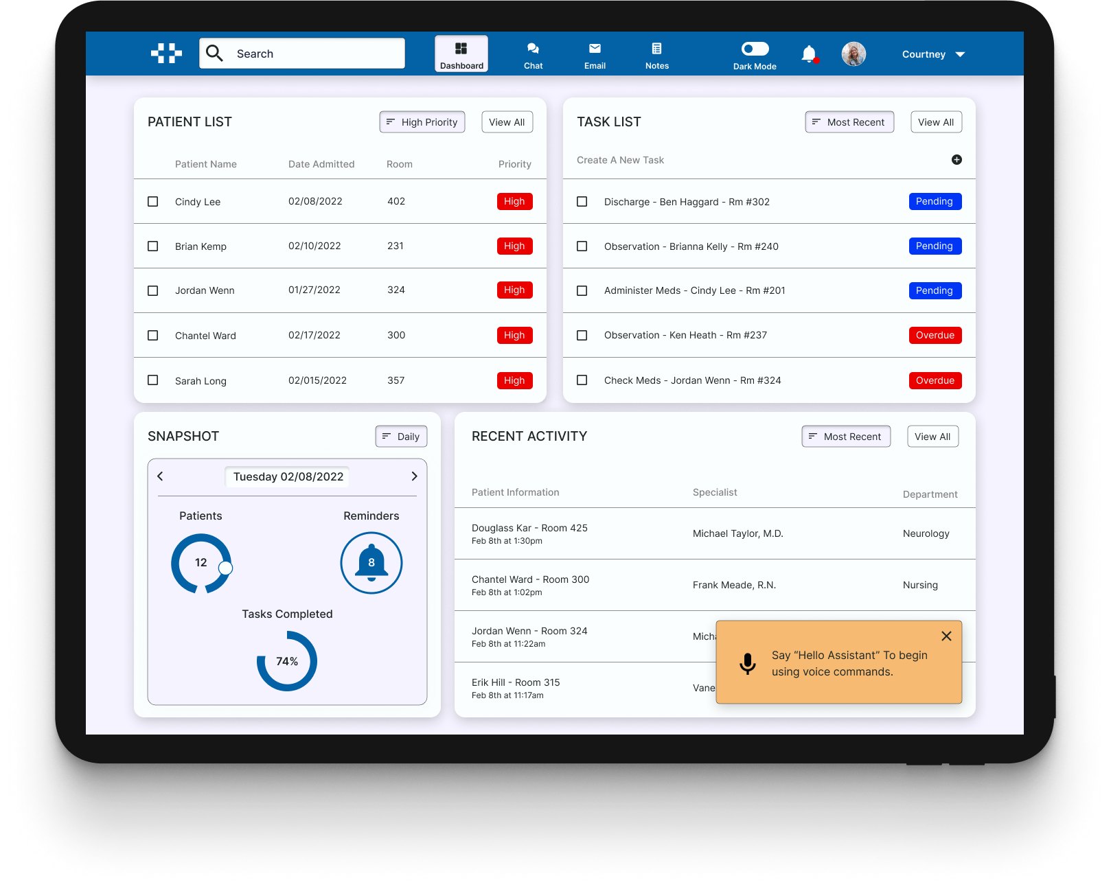
Meet Courtney
Courtney encompasses the needs and frustrations of the nurses I spoke with. Continuing to explore designs with her needs in mind will help create a successful prototype.

How can we help Courtney?
Courtney is an ICU nurse working with many patients that have varying needs. Considering her desire for easy and error free documentation:
How can we reduce the number of clickable items?
How can we increase communication with other members of her team?
How can we help with task and patient prioritization?

IDEATE
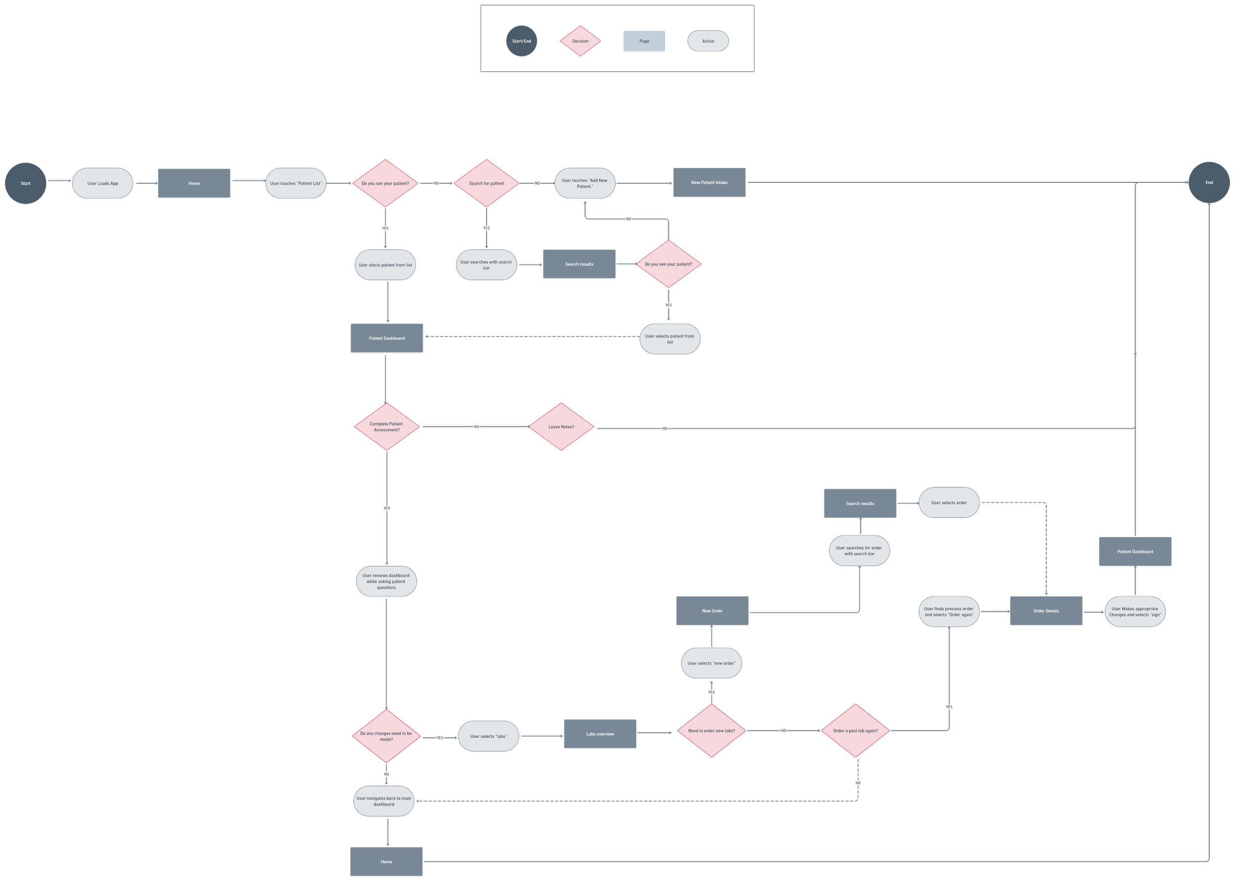
Exploration
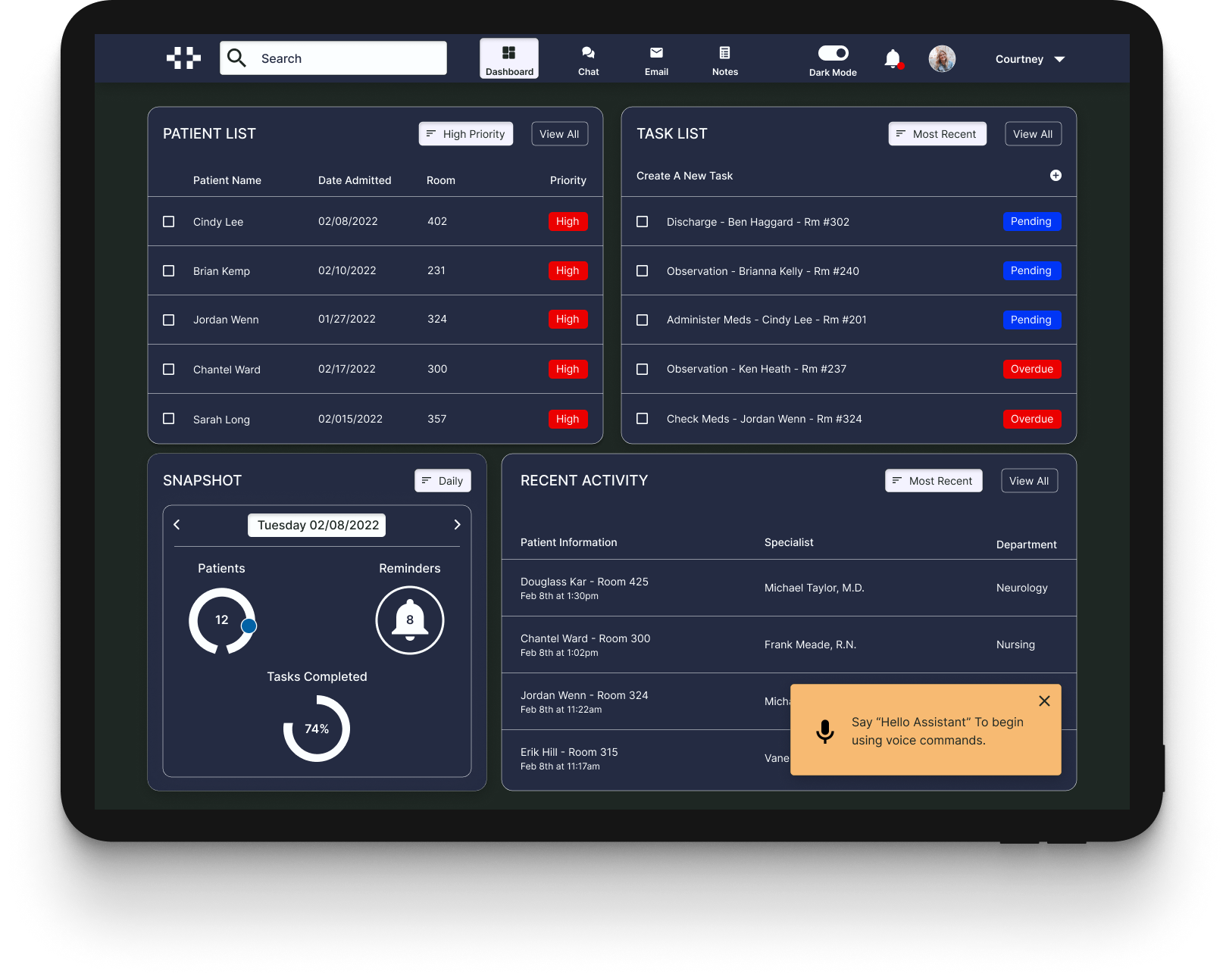
When I began wireframing, I focused on ways to increase transparency, prioritization, and Communication. Main features would include a dashboard with a summary snapshot of patient data and activity, an interface designed for a tablet, and the ability to use voice commands.


Creating The Brand
Once I understood the user flow and general infrastructure of the application, I began to build out brand elements that would continue to solidify my previous ideas, and continue to promote ease of use and simplicity.

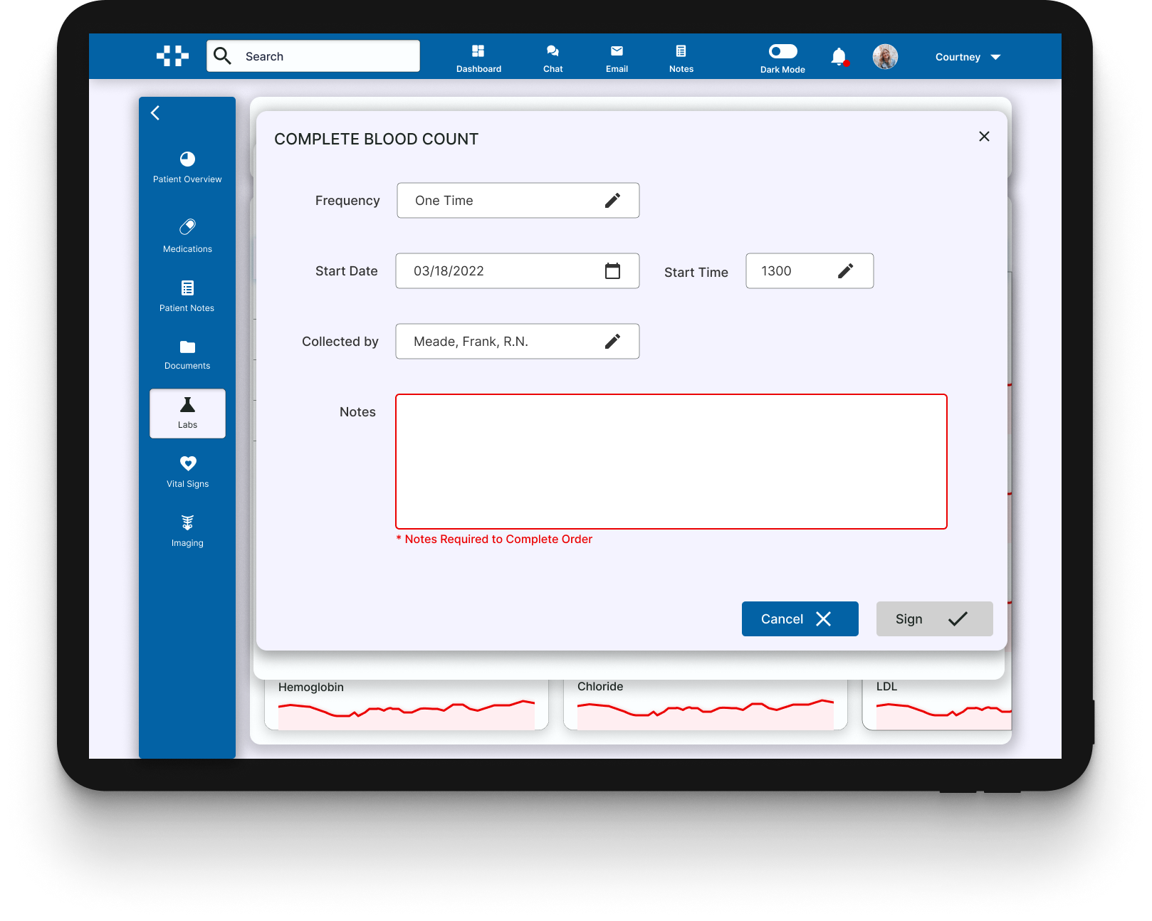
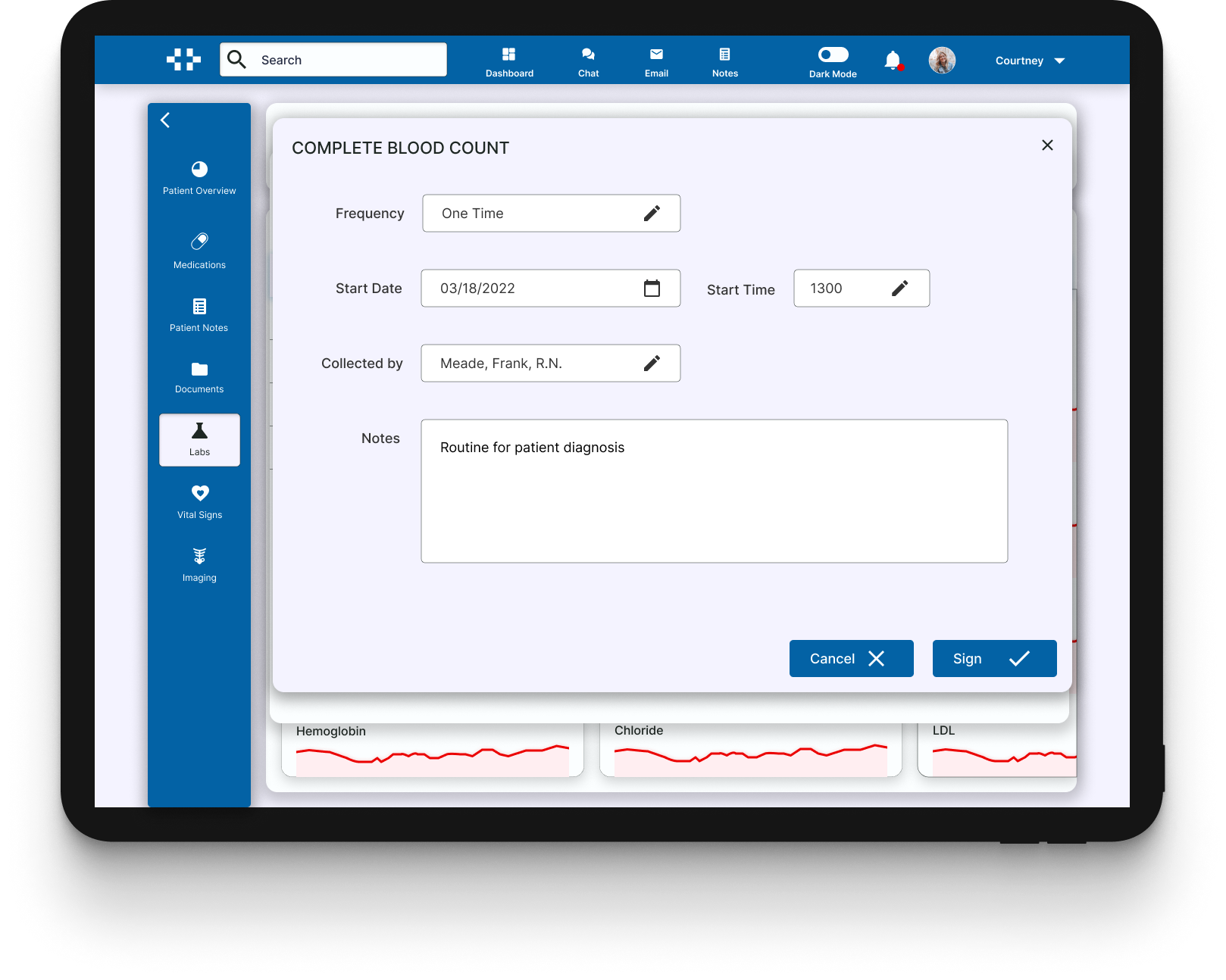
PROTOTYPE


TESTING
User Testing Overview
I conducted one round of user testing with 5 Nurses. I set out to understand the following:
How users interact with the application interface while completing a task.
Any elements that cause confusion or frustration for the user, such as buttons, navigation, and labeling.
Any missing or redundant information.
That the overall design is intuitive and easy to navigate.
Key Takeaways
Useful & Informative
The information being presented on both the main and patient dashboards, were well received and perceived as being helpful. However, some information such as vital signs, were oversimplified.
Intuitive Navigation
All testers were able to navigate through the task at hand with minimal error.
Missing Patient Data
Although there was a lot of helpful information, a common comment was that some crucial information was oversimplified. Key information such as allergies and contact info, were hard to find.
Priority Revisions
The main concern from testers was that, there was an oversimplifying of some of the data on the patient dashboard. The two main problem areas were:
The patient information section didn’t contain crucial information, such as code status, allergies, and ID number.
The vital signs were not displayed in a way that would be easy to monitor trends and updates.
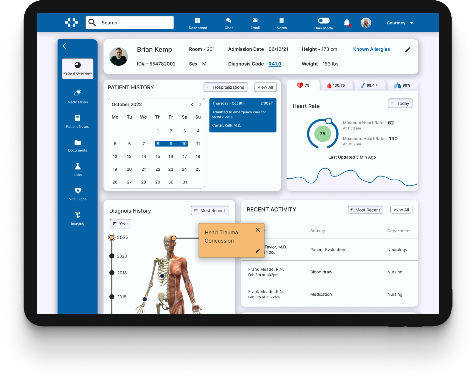
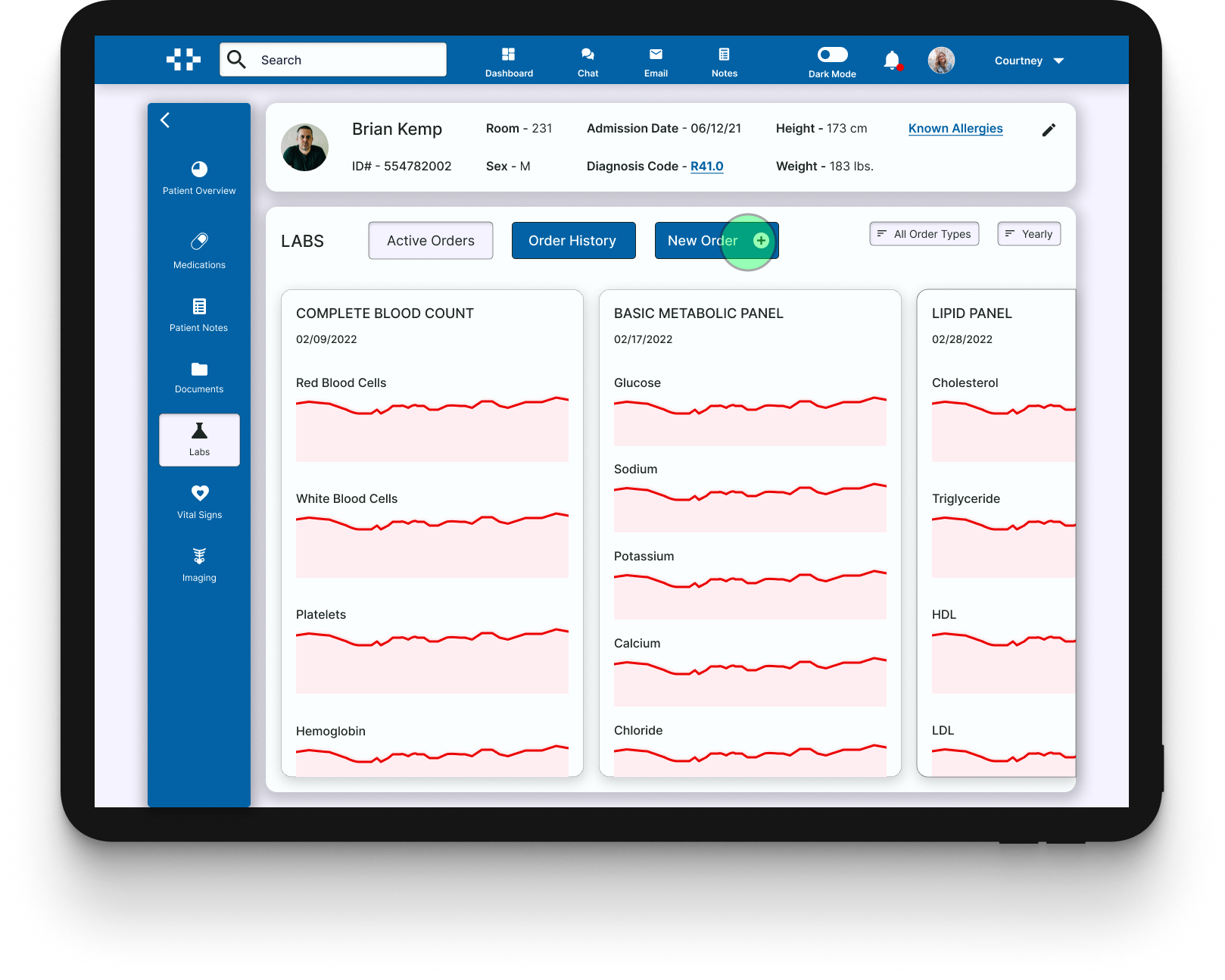
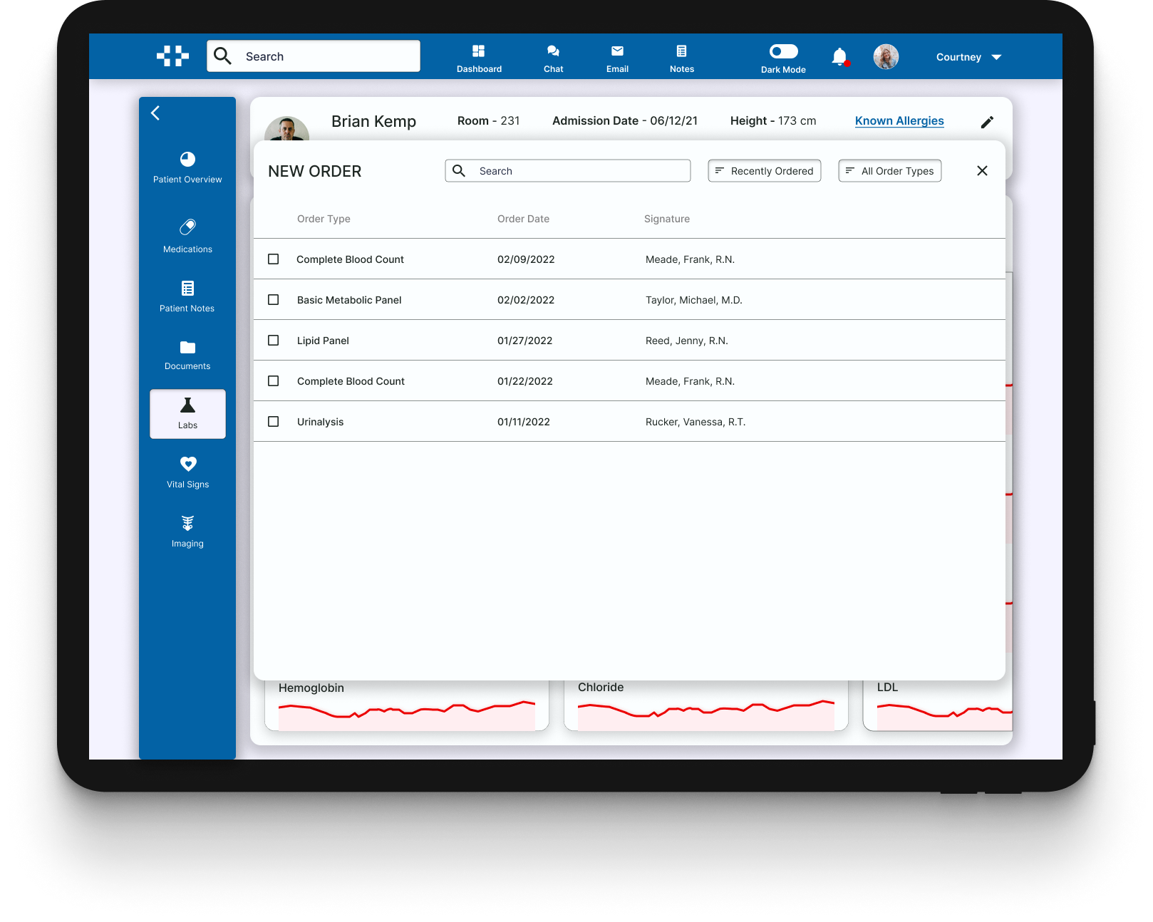
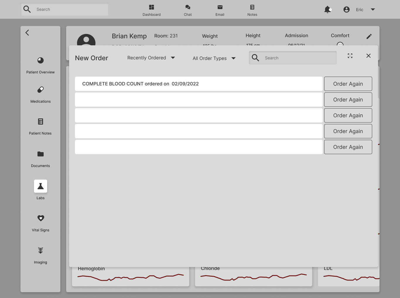
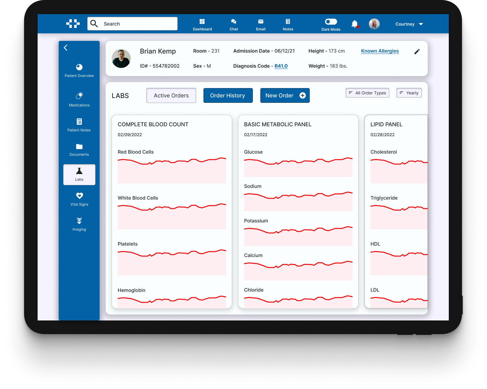
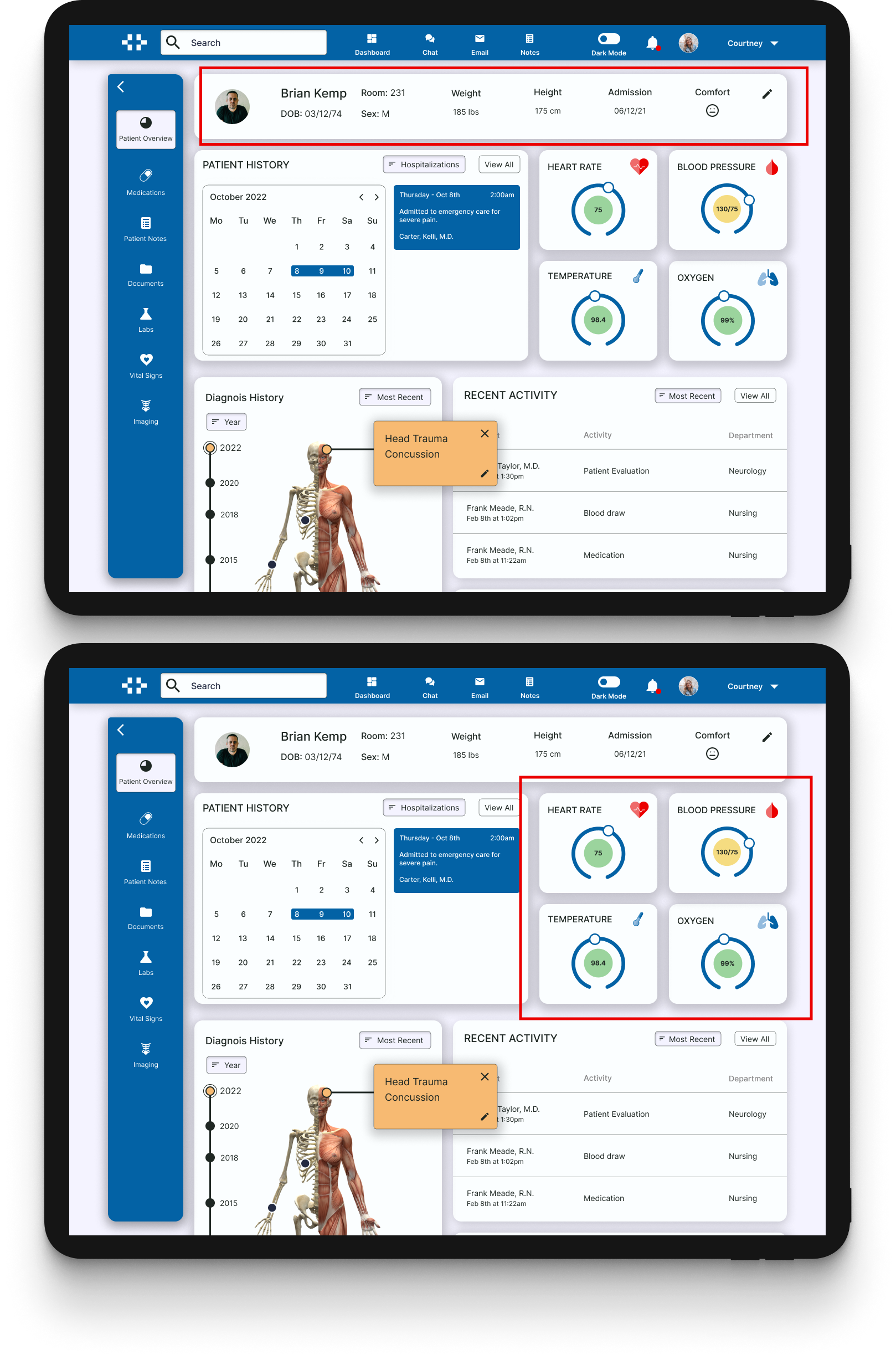
A Revised Dashboard
I updated the vital signs section to show a trend graph with filtering options, and an update for when the reading was last taken. I also added tabs to show the other common vitals being monitored.
I also added ID, code, and allergy information to the patient data section. The diagnosis code and allergy sections both contain links that would display pop-ups showing more detailed information.
Next Steps
Medical software is incredibly complex and creating a viable solution to the challenges discussed in this case study will take many more rounds of testing, iteration, and understanding.
I will plan to continue to test this product among a larger pool of nurses, and continue to research and deepen my understanding of prominent medical software. I believe that there is a great need for an overhaul of EHR applications, and I would find great enjoyment out of continuing to explore creative solutions, that could utilize new technology.